
Preparing app icons can be confusing because the Google Play listing icon and the icons installed inside an Android app are related, but they are not the same asset. The safest workflow starts with one clean, high-resolution square design and exports a separate file for each destination.
The Google Play listing icon
Google Play uses a final store-listing icon measuring 512 × 512 pixels. Keep the source artwork crisp, avoid tiny text and check the icon at small sizes before uploading it. The store applies its own presentation treatment, so the uploaded artwork should not include a fake device frame or excessive outer decoration.
Android launcher density sizes
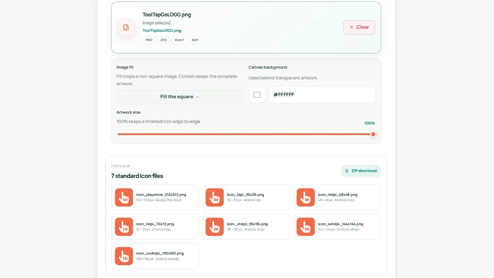
A traditional 48 dp launcher icon maps to several bitmap sizes: 36 × 36 for ldpi, 48 × 48 for mdpi, 72 × 72 for hdpi, 96 × 96 for xhdpi, 144 × 144 for xxhdpi and 192 × 192 for xxxhdpi. Supplying the correct density files helps launchers display a sharper icon instead of scaling one bitmap up or down.
Adaptive icon layers
Modern Android launchers can mask icons into circles, rounded squares and other shapes. Adaptive icons therefore use separate foreground and background layers. Keep the important symbol within a generous safe area because the launcher can crop the outer parts differently on each device.
A reliable export workflow
- Start with a square master image at 1024 × 1024 pixels or larger.
- Keep the logo centred and leave breathing room around the edges.
- Export the 512 × 512 Google Play image separately.
- Generate the six Android density files with predictable names.
- Generate foreground and background adaptive-icon assets.
- Open the smallest 36 × 36 and 48 × 48 files to confirm the design remains recognisable.
The Google Play App Icon Generator creates the common icon sizes and packages them in one ZIP file. You can then place the relevant files into your Cordova, Capacitor or native Android project.
Common mistakes
- Using the same flattened icon for every adaptive layer.
- Placing text or fine detail too close to the edge.
- Upscaling a small source image, which produces blur.
- Uploading a screenshot instead of a clean icon asset.
- Forgetting to test the icon against both light and dark wallpapers.
Further reading
Android Developers maintains the current Google Play icon design specification and Android density guidance: Google Play icon design specifications and support different pixel densities.
Continue with the right tool
Use the related workflow above, or browse the full ToolTapGo directory for a different task.